At first, this project seemed counter-intuitive, reading from the brief
“…And while they don’t care what name you come up with, they did have some mandatory input regarding the way in which you render their logo: They want all elements of the system to be rendered in a hand-wrought calligraphic style…”
A highly advanced technology company wants a logo that’s in script form?! As a designer who pays attention to what other companies and brands do, this stipulation isn’t exactly a great starting point at first glance. How many tech companies do you see that have brands rooted in script or hand drawn elements? There aren’t that many companies that come to mind. So the first hurdle was to step back and get out of the comfort zone, oh and do tons of research as well!
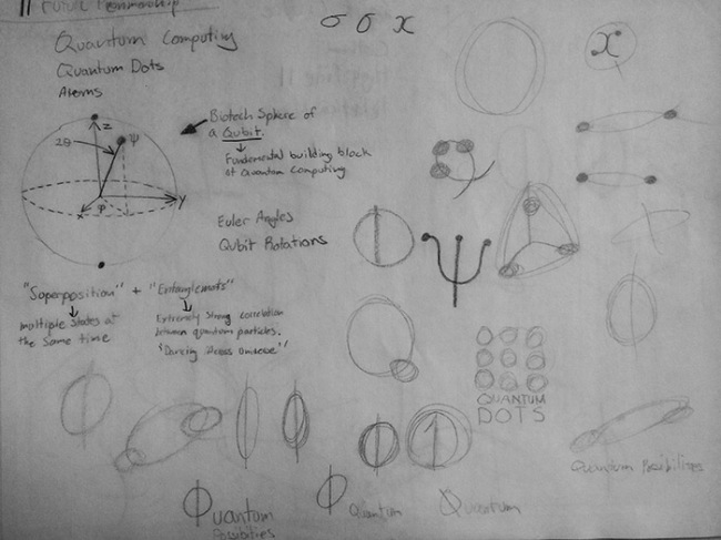
First order of business in just about any design adventure is to do research. Since this company boasts its perfection of quantum computing, and myself only being a novice viewer of the Science Channel, I had to figure out what makes a quantum computer work and what makes it so revolutionary. Now, without going into all sorts of details and figures into how a quantum computing works, here is my sketchbook page with my notes on the issue. There were tons of resources and lecture notes on quantum computing that I found so very helpful in understanding quantum physics for computing. You can find one here
Once I felt that I had a firm grasp of the subject, it was off to the next phase, sketching logo concepts. I really liked the idea of superposition in quantum physics and its relation to computing. (I won’t go into too much detail, but you’re free to look it up and see for yourself!) With computing now, lines of code are displayed like this: 010011010110111101101111011011100110010101111001010001000110010101110011011010010110011101101110
and with enough lines of code, it can limit a computers’ processing speed:
Now, with quantum computing and superposition, all those ones and zeros become super imposed onto one another and can be read many times faster. (Again, I’m really over simplifying) Essentially, the ones and zeros are on top of each other, which gave rise to the logo concept of a symbolic circle (The zero) with a vertical line going through the center (The one).
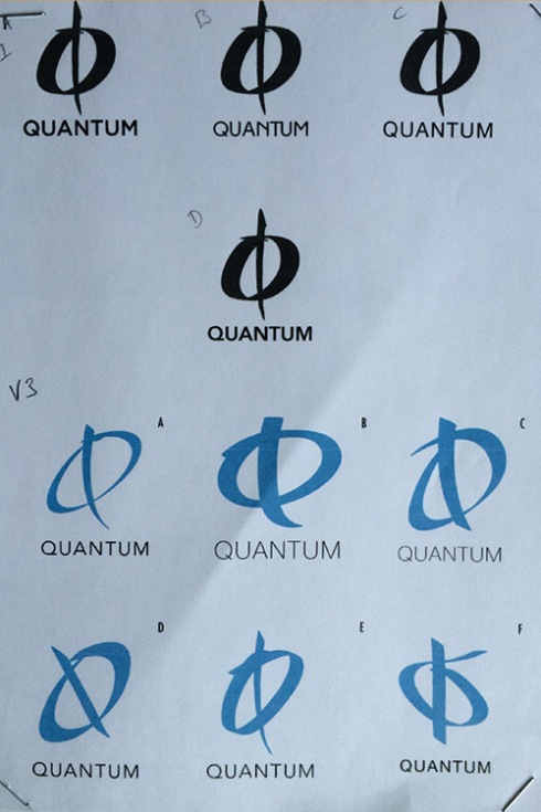
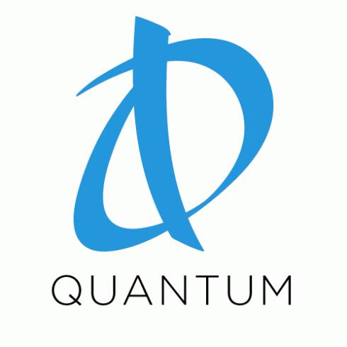
With this idea of drawing ones and zeros and representing superposition, I drew so many different variations of the circle with the line going through it. Eventually, I devised what you see below, but now I had to figure out a color and how the logo may be used for a company like this.
I decided a lighter blue would be best because of its link to high intellect, but using a light blue, makes the brand more approachable to the common user as it is associated with understanding. The idea of quantum computing alone makes it intimidating to the average user (Heck, most of everyone would feel intimidated and perplexed about quantum computing) so using colors like blue and green along with a clever marketing campaign to make the idea of quantum computing simple and clean makes sense from a design and business perspective.


