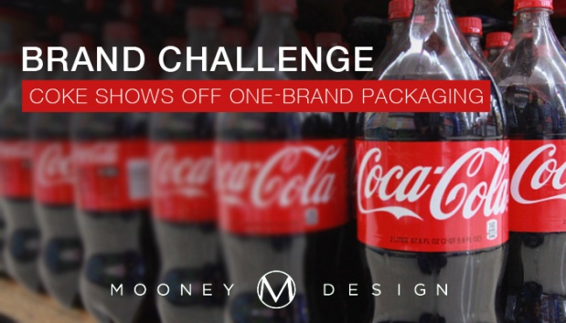
This month in Mexico City, Coca Cola unveiled a new “One Brand Packaging” approach to its product line. Executives said it’s a “contemporary spin on a classic icon” by utilizing the Coca Cola red disc. Those of you who are not as familiar with Coca Cola’s brand, the classic icon they’re referring to is the red disc pictured below. It was first introduced in the 1930s on hand-painted Coca-Cola advertising, and according to Coca Cola, the Red Disc has become synonymous with “great taste, uplift and refreshment”

Undoubtedly, any change to such an iconic brand such as Coca Cola, is going to be a huge challenge. If executed wrongly, it’ll hurt the company’s brand and bottom line financially. In today’s market, where soda consumption is at new lows for the 11th consecutive year in the U.S., damage to the brand would border unsurmountable. Luckily though, Coca Cola has bounced back from major PR disasters in the past involving its brand so it knows first hand what works and what doesn’t.
In 1985, Coca Cola decided to change its formula amid rising competition from Pepsi and even brands owned by Coke (Sprite & Fanta). So it devised a formula that was preferred in focus groups over Pepsi and called it “New Coke”. Long story short, many boycotted the new brand and Coca Cola eventually brought back its classic formula and ditched the brand labeled as “New”. Coca Cola 1985 Brand Failure
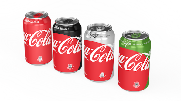
So when Coca Cola unveiled a new design, it’s no surprise that when they looked at the challenge of a rebrand, they were looking to their beloved and iconic history for inspiration. Thus the contemporary spin on a classic icon was devised. At least on their packaging. Now the cans show off the iconic Coke Red for classic, Silver for light/diet, Black for zero sugar, and Green for their Coke Life. To be honest, this is the first time I’ve seen or heard of Coca Cola Life, so in case you were wondering too, it’s a lower-calorie version of Coca-Cola, using stevia and sugar as sweeteners. The More You Know.
“By applying the Coca-Cola Red Disc to our packaging in such a bold way, we are taking the next step towards full adoption of the ‘One-Brand’ strategy, uniting the Coca-Cola family under one visual identity and making it even easier for consumers to choose their Coca-Cola with or without calories, with or without caffeine.”
– Chief Marketing Officer Marcos de Quinto
This approach to the “One Brand Packing” is not only contemporary by its simplicity, but also influenced by its failures 30 years ago. Using imagery that invokes the classic taste and admiration of coke is not only a smart marketing and branding solution, but also essential to the Coca Cola brand identity. Aesthetically, the new designs are bold without taking away the classic feel of Coca Cola and they don’t fall into the trap of looking like its other products, thus confusing consumers on what exactly they just picked up or bought.
Unfortunately though, the U.S. won’t see these cans for at least another year if not more or at all while Coca Cola works on it’s already busy marketing schedule in 2016. So we’ll have to go to Mexico to get an up close look for now. Will this brand experiment last? Only time will really tell, which is probably why Coca Cola is choosing to limit this new brand to a select few countries. Overall though, I believe it’ll be successful in its goal to unify the brand.
Well done.


